How to Tell If Your Website Converts: A Practical Checklist

Originally published 28 December 2016; substantially updated 5 November 2026.
A website can look polished and still make it difficult for a visitor to take the next step. The useful question is not whether it is a “selling website” in the abstract, but whether the right visitors can understand the offer, trust it and complete the action you want.
Start with one measurable action
Choose a primary action for the page: a qualified inquiry, a booking, a purchase or another meaningful step. A form submission is usually a lead, not a completed sale. Write down how you will recognize a useful lead and who follows up. If one page serves several audiences, make each path clear rather than forcing everybody through the same message.
Check the path from visitor to inquiry
- Offer: Can a new visitor tell what you do, for whom and what happens next? Use a specific headline and explain the value without unsupported superlatives.
- Evidence: Show accurate examples, scope, process and genuine proof where you have permission to publish it. A logo, certificate or testimonial is only useful if it is real and relevant.
- Navigation: Put the next step where it makes sense. Test the page on a phone and make pricing or the way to request a quote easy to find.
- Forms and contact: Submit a test inquiry yourself. Confirm that required fields, spam protection, delivery and follow-up work. Offer an accessible alternative if a form fails.
- Traffic fit: Compare the promise in an ad or search result with the landing page. A mismatch can waste visits even when the page itself is well designed.
Measure the whole journey, not one percentage
First record the baseline for each meaningful traffic source: visits, completed actions and the quality of the inquiries. Conversion rate is completed actions divided by relevant visits for the same period and definition. Keep purchase rate separate from form completion rate. If paid traffic is involved, compare cost per qualified inquiry with actual sales and the value of those sales. Small samples and different audiences can make headline percentages misleading.
Use your analytics, ad reports and customer records together, subject to your consent and privacy setup. Look for a clear drop-off: few people reach the offer, many start but do not finish the form, or inquiries arrive but do not become customers. Each pattern suggests a different question to investigate; none proves a single cause by itself.
Improve one bottleneck at a time
Fix broken forms and confusing mobile layout first. Then test a clearer offer, more relevant examples or a simpler next step. Note what changed and compare like-for-like periods. Do not promise a universal conversion benchmark or expect a design tweak alone to create demand.
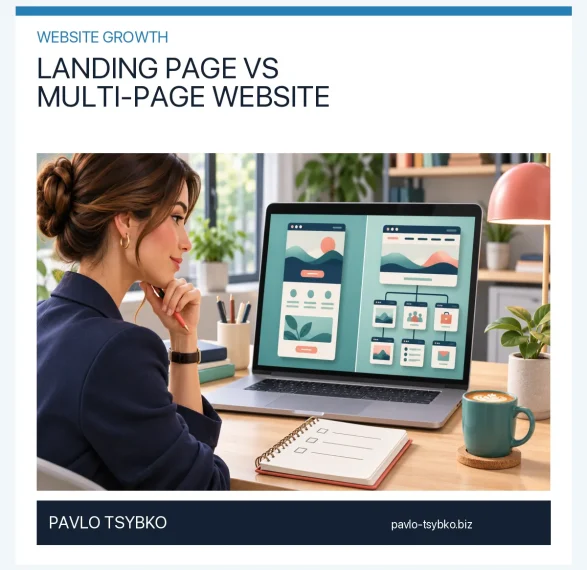
If you are choosing between a focused landing page and a larger site, read Landing Page vs Multi-Page Website. The right format depends on your offer and the questions visitors need answered; either format still needs a working path to a real business outcome.
A short pre-launch check
- The headline matches the audience and traffic source.
- Offer, scope and next step are understandable without a sales call.
- Contact links, checkout or forms work on desktop and mobile.
- Claims and examples can be substantiated.
- Analytics distinguish visits, leads and sales without overstating causation.
A useful website is not defined by a fixed conversion percentage. It gives the right visitor a clear decision and gives the business enough evidence to improve the journey responsibly.